
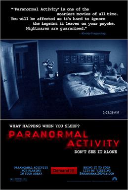
Posters


Trailers
One of the most popular supernatural franchises is paranormal activity which only had a budget of $28.015 million across all six films the franchise has made $889 million at the box office across 2011-2015. The film franchise was produced by privately owned company Blumhouse Productions and distributed by Paramount Pictures.
Due to the film having a $15,000 budget the film heavily relied on word of mouth for people to here about the film.

Due to the film being so successful in Japan a Japanese production company called Presidio Corporation made the sequel in 2010 based after the events of the first film.
Merchandise.

Even with the first film being released in 2007 a video game was released in early 2016 called 'Paranormal Activity VR'. The game was released across PS4, Xbox One, and has also been made for the Oculus Rift.


T-shirt Phone cases Prank USB stick

Prizes from a AMC competition where you could win a hat, t-shirt, all of the Paranormal activity Blu-ray dvds, a rucksack, and a camera.

Prizes from a twitter competition including two t-shirts and a phone case.

Projector keychain that spells out "PA4" which was released before the release of the fourth film
Trailer and magazine.
Real media text
Real media text

Main image: In both the magazine and the trailer we see the antagonist. For both the magazine and trailer we never see the antagonists face. The main reason for this is to keep the audience interested and intrigued to find out who the killer is. Only in the trailer however do we find out that the antagonist uses a knife as a weapon.
Colour scheme: The colours used across the trailer and magazine are rather similar. The colours of some of the tag-lines such as the yellow and blue ones are similar to the colours of the clothing that the main characters wear.
Fonts: The fonts across the trailer and the magazine are rather different. For example the Scream in the magazine and the trailer are the same font but the one in the trailer is more distorted to the one in the magazine.
Our trailer and magazine.

Font: In terms of the fonts used between the trailer and the magazine none of them are the same apart from the title of the film. The main reason for this is that the title of the film will need to be the same wherever it's seen so people can easily recognise it.
Colour scheme: In terms of the colours used the blue used in the trailer is similar to that of the background. The main reason for this is that when someone watched the trailer and then sees the poster they will be able to see the similarity in the colours.
Image/characters: In both the magazine and the trailer we have used the same characters. The main reason for this is so that the audience become familiar with the characters instead of having different characters on the magazine and in the trailer which would make the audience confused as to who the actual characters are.
Synergy throughout media platforms.
Synergy is the way in which products look similar in order to create cross-media convergence. When creating promotion items such as a poster for a bus stop I had to make sure that they look the same through elements such as the colour scheme, main image, title etc.
 Bus stop advert.
 Cineworld website.
 Wikipedia page.
 IMBd page
 Times square billboard


